

Summary
Many of today's food ordering apps often have clutter or recommends unhealthy fast food restaurants. With the advent of the COVID-19 pandemic, local businesses suffered the most. The Munch app aims to create a marketplace with an emphasis on local eateries, while maintaining a streamlined interface.
Identify pain points related to ordering food. Design an app that solves pain points and makes it simple to order local eats.
UX Designer
- Mockups
- Prototyping
- Usability Studies
- User Interview
- Wireframing
Research
After I received my Sharpen prompt, I first set off to investigate user pain points of our competitors. Throughout the whole project, I utilized qualitative research methods. For instance, competitive audits, surveys, user personas, and usability studies.
- Name: Alexis
- Age: 19
- Role: Biochem Student
- Location: Toronto
Alexis is a undergraduate student who finds herself extremely busy with her studies. She usually orders Subway as she believes it is healthier than the alternatives. However, since the COVID-19 pandemic, she hopes to easily find local alternatives.
- Name: Billy
- Age: 48
- Role: Plumber
- Location: Montreal
Billy is a brutally honest plumber. He prioritizes family over everything else. Billy typically drives to restaurants to order food. However, his children told him about online food ordering. He would like to experiment with the flavours of his locale.
Starting the Design
I began the project by creating a user flow, which enabled a visualization of a user ordering food.
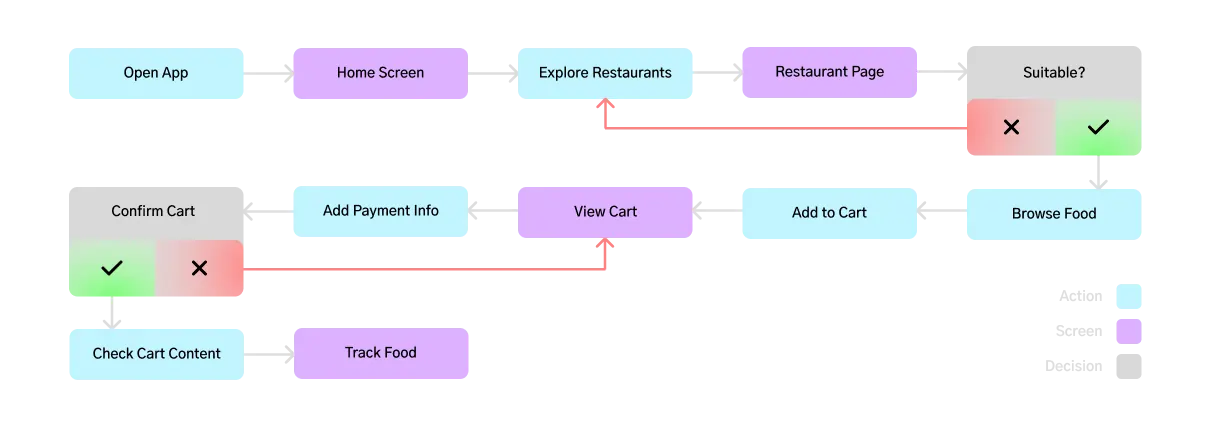
The preliminary user flow allowed me to understand what a user would typically expect when trying to order food. I initally sketched six different variations of the home screen.
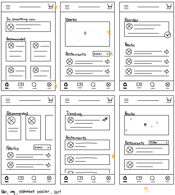
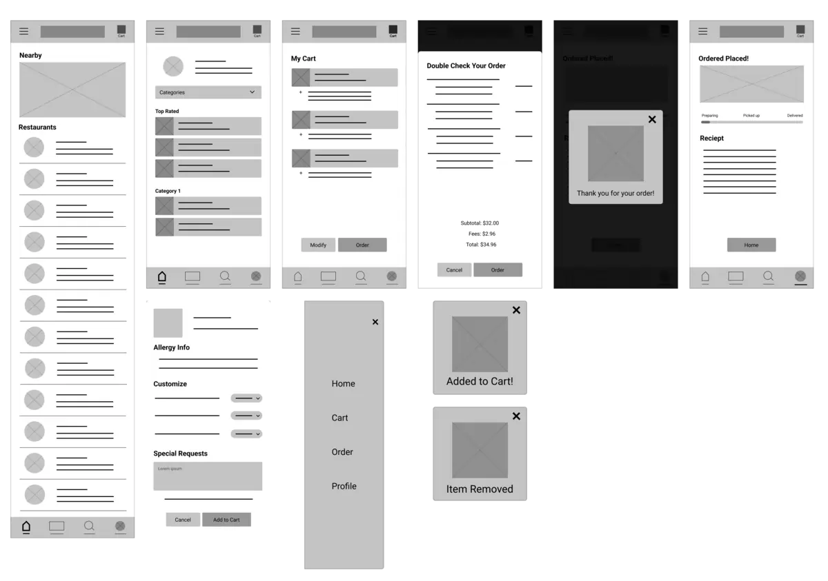
After deciding on which elements I wanted to keep, I repeated the process with every screen. Thus, I translated the sketches into a wireframe in Figma.
User Testing
The first order of business is to conduct a usability study with my low-fidelity prototype. I gave the participants a goal to order food and monitored the steps they took. I then allowed time for user feedback, which resulted in three critical insights.
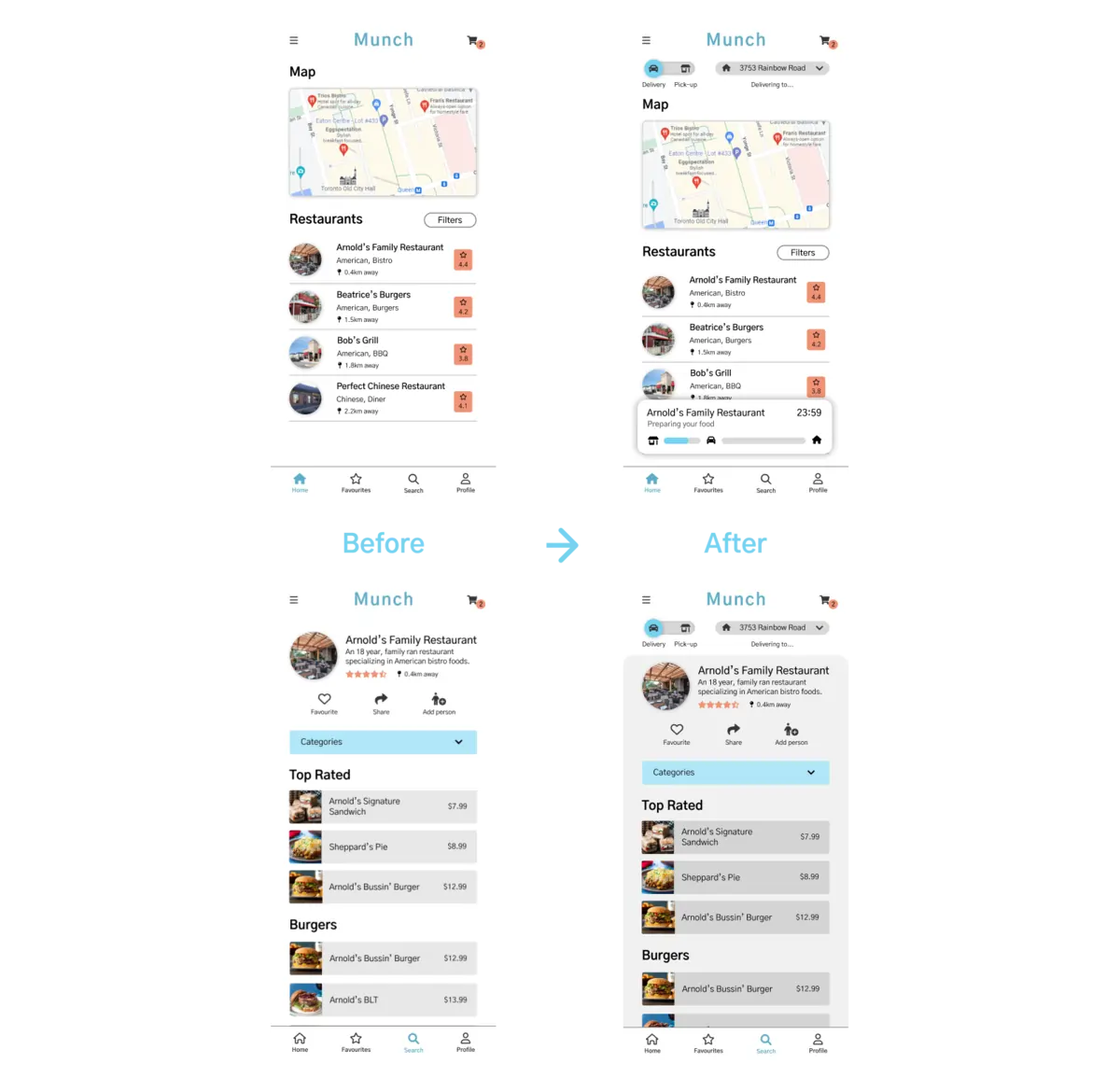
Users want to be able to select which card to pay with before ordering. In addition, they want the card to appear more prominent to ensure accurate payment selection.
Users want a way to view a restaurant's ratings and also give their own ratings.
Users want a way to reach out when an order does not go the way they expected.
The second round of usability studies uses a high-fidelity prototype, allowing for further iterations on the mockups.
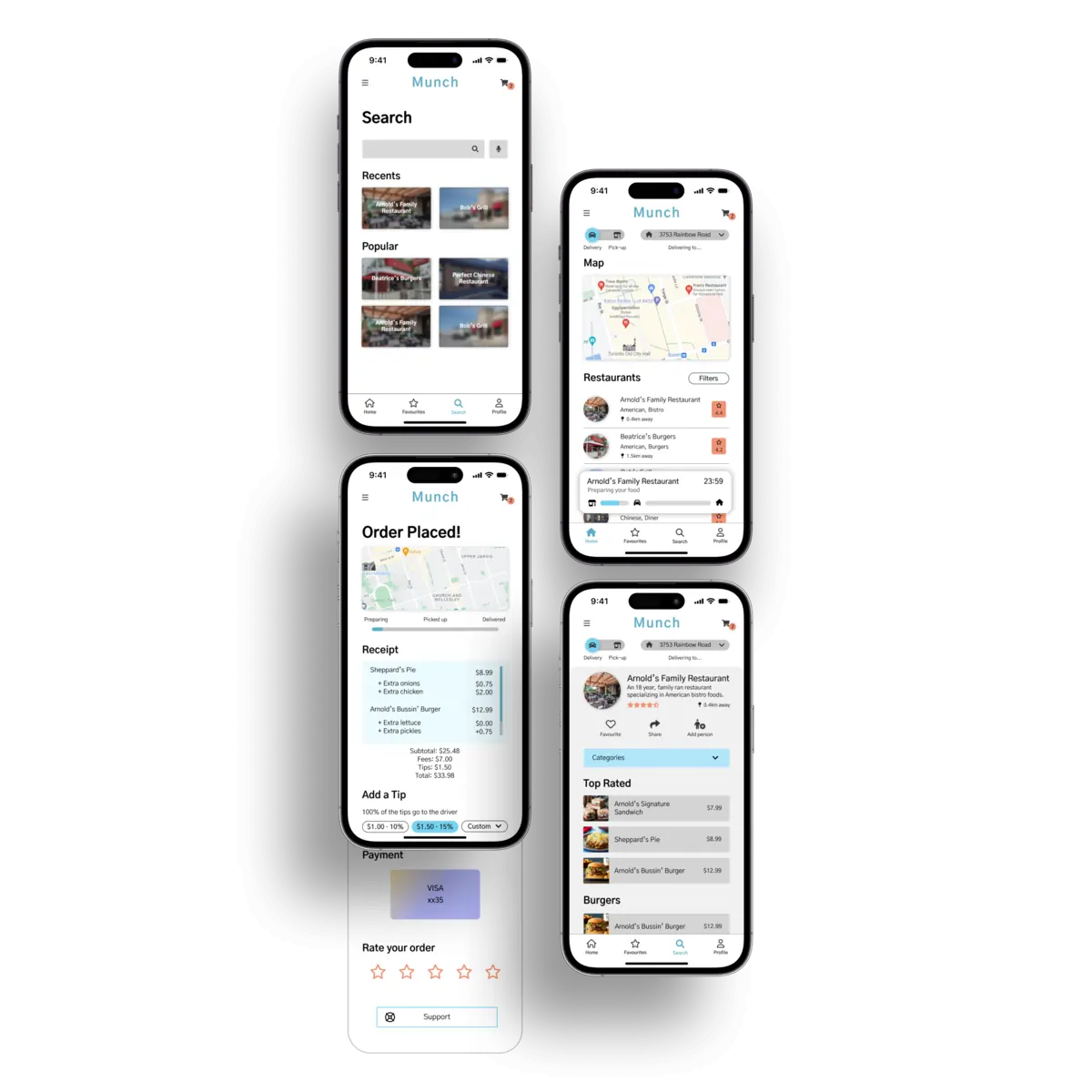
Final Design
Concluding Thoughts
As part of the Google UX Design Certificate Program, this project allowed
me to apply what I learned throughout the course. For instance, user
journey mapping, personas, iterative design, usability studies, and more.
As my first user-centred piece, it helped me empathize with users to
create a cohesive experience.
Further directions with this
design may include conducting another usability study to identify any new
pain points. Additionally, user surveys may also help identify areas of
dissatisfaction and areas that need improvements.