

Summary
Many online booking websites for vacation stays often features complicated interfaces. Consequently, users expressed that they feel stressed when trying to find the perfect stay. The objective of this website is to create a simple and powerful booking platform, focusing on ease-of-use.
Identify pain points related to booking vacation stays. Design a responsive website that users will find stress-free to use, while solving major pain points.
UX Designer
- Mockups
- Prototyping
- Responsive Design
- Usability Studies
- User Interview
- Wireframing
Research
The project began with a user interview aimed at finding any roadblocks users have with their online booking experiences. The interview involved users that previously used a booking service in the past (e.g., Expedia, AirBnb). I conslidated the findings into three different user pain points.
The user interface of some sites often have a lot going on, making it difficult to grasp the important details.
The accessibility filters (e.g., no-stair entrances) are sometimes hidden away and only accessible after searching.
Users found it frustrating when they were booking a place with their co-workers/friends.
After gathering data and pain points from the user interview, I created two personas to help better empathize with the users.
- Name: David
- Age: 35
- Role: Entrepreneur
- Location: Toronto
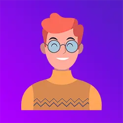
David is an entrepreneur who frequently travels for work. They are irritated at how complex it is to figure out whether a location has accessibility considerations. Additionally, they are overwhelmed by how complicated it is to find a place to stay.
- Name: Michelle
- Age: 24
- Role: Legal Assistant
- Location: Montreal
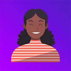
Michelle is a full time legal assistant. They work long and tough hours and would love to efficiently book vacation trips. They find that booking trips with friends is often frustrating. They find that there is a lot of back-and-forth and wasted time trying to decide where to go.
Starting the Design
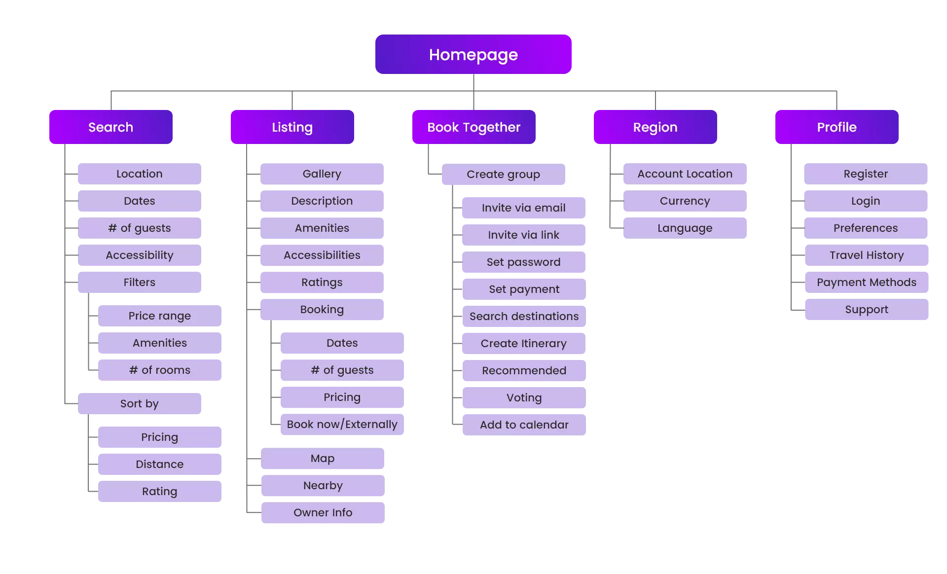
With consideration of the user needs, I created a sitemap for the website. The sitemap lays different paths users can take with the product. I found it to be crucial when planning out the organization of the website.
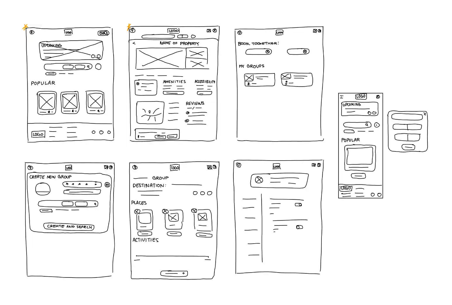
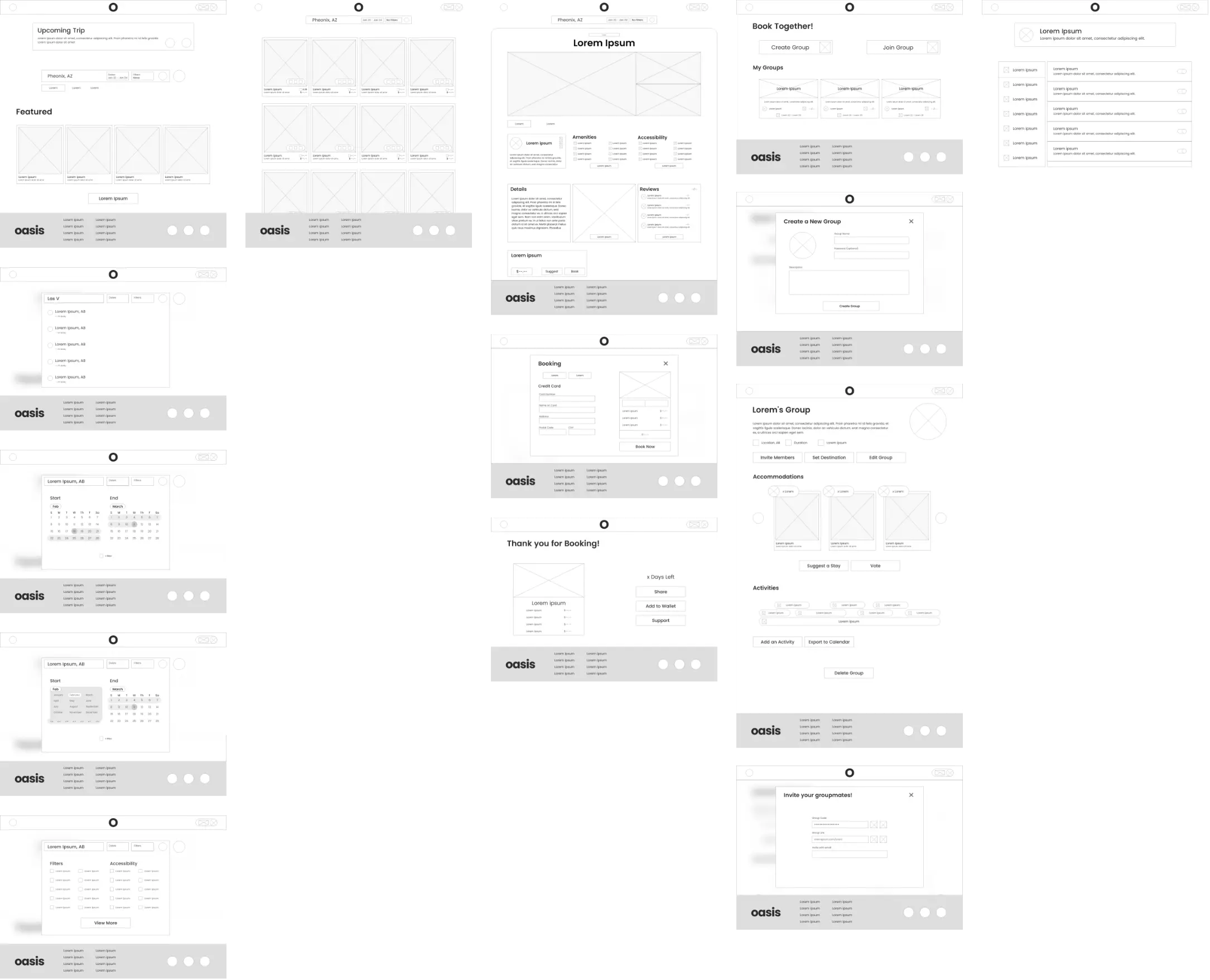
With the basic skeleton of the website completed, the next step was to create paper wireframes. This allowed quickly iterate through ideas for how the would look.
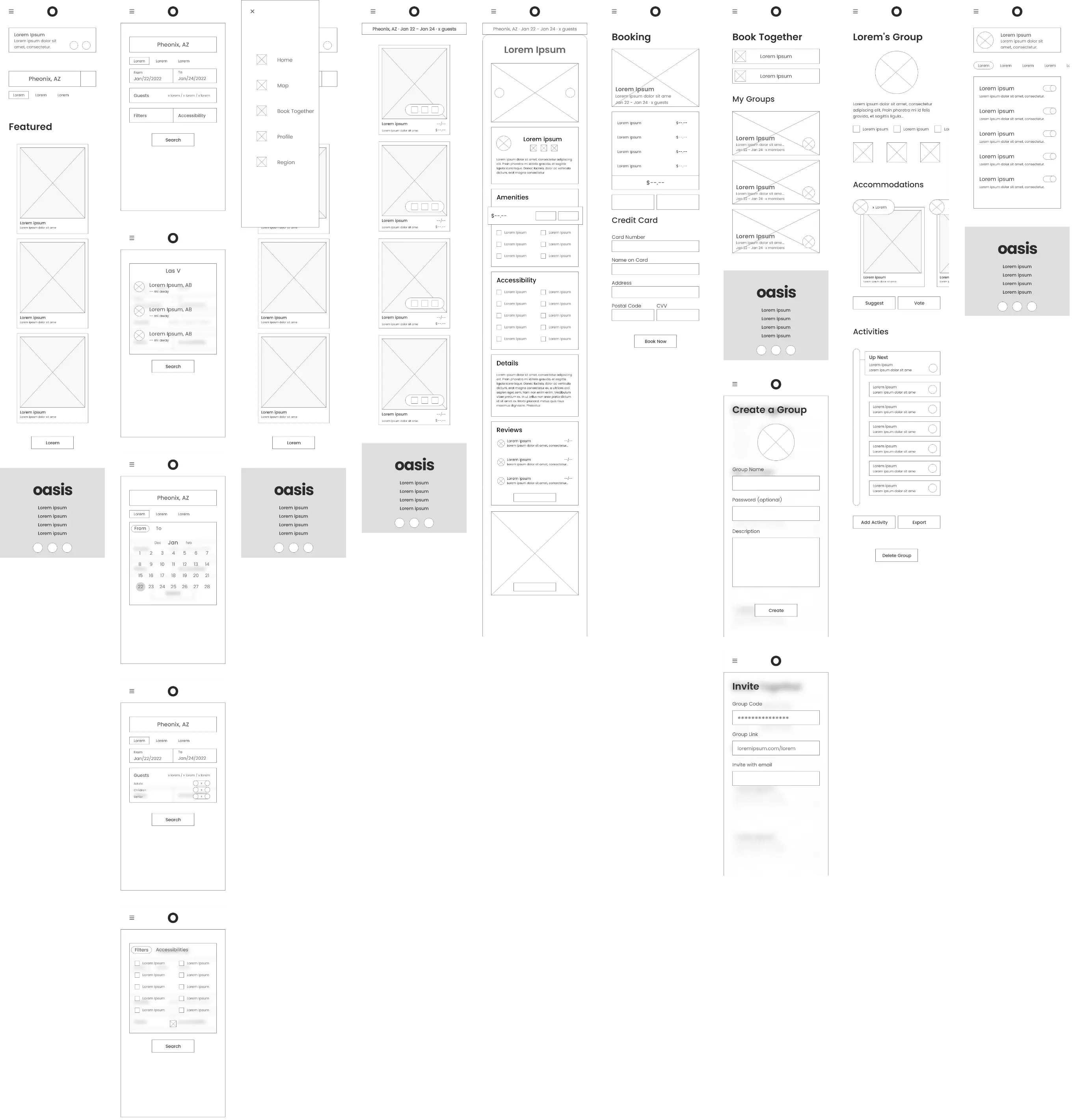
After satisfactory paper wireframes, I converted the designs into digital wireframes using Adobe XD. I created a pair of mobile and desktop wireframes. Thus, the digital wireframes enabled the ability to gether more feedback.
User Testing
After connecting the wireframes into a low-fidelity prototype, I set out to test it with a usability study. The parameters of the study include: (1) An unmoderated usability study, (2) remote study in Canada, (3) five particiapnts, and (4) a duration of 20-40 minutes. The data from the usability study gave three important insights.
Users wanted a way select a previously used card for future bookings.
The current navigation bar do not sufficiently describe where an element links to.
Elements there were toggleable lacked contrast. Some users reported not konwing whether an option was on or off.
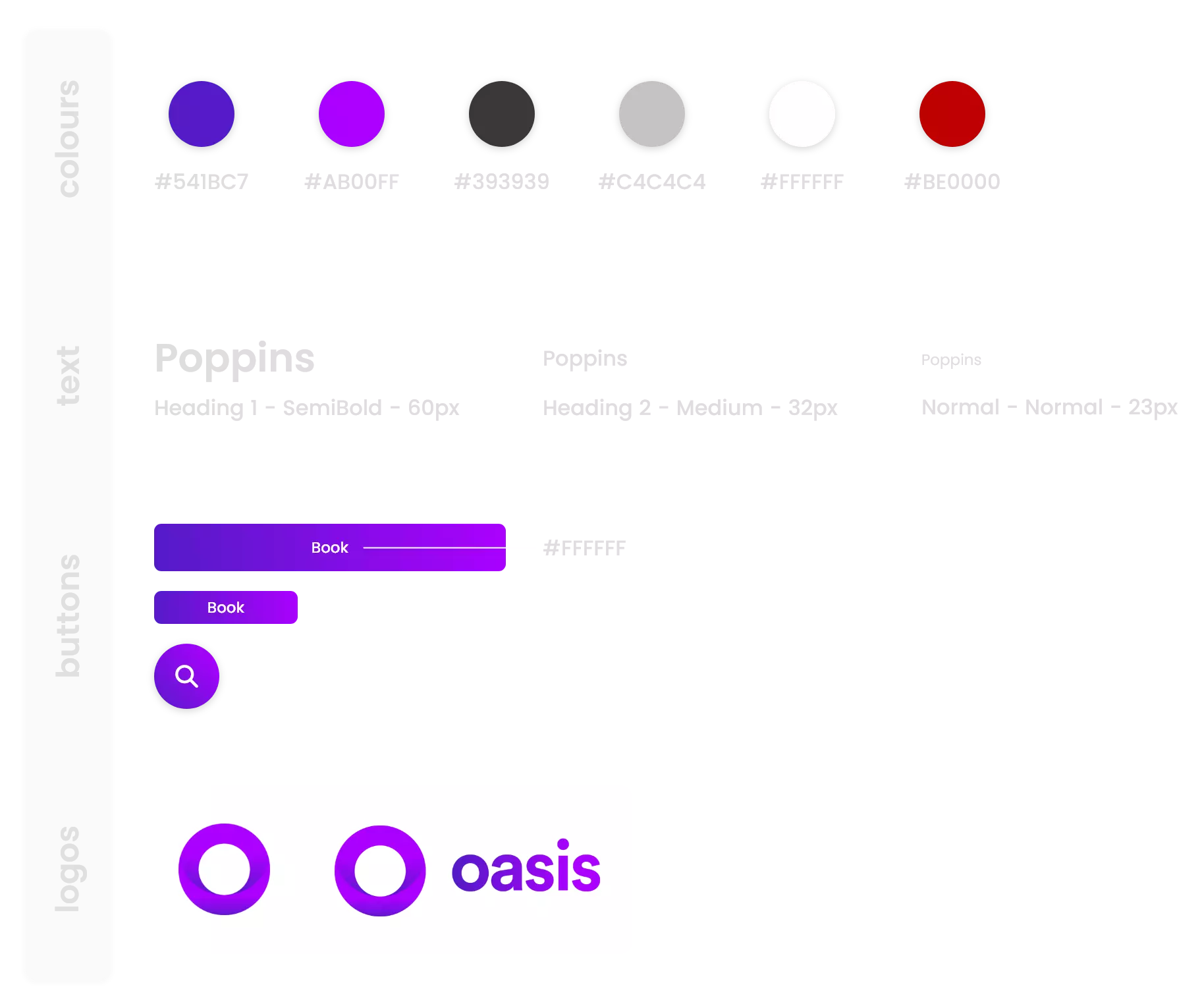
The insights were consequently implemented into the next iteration of the designs—the mockups.
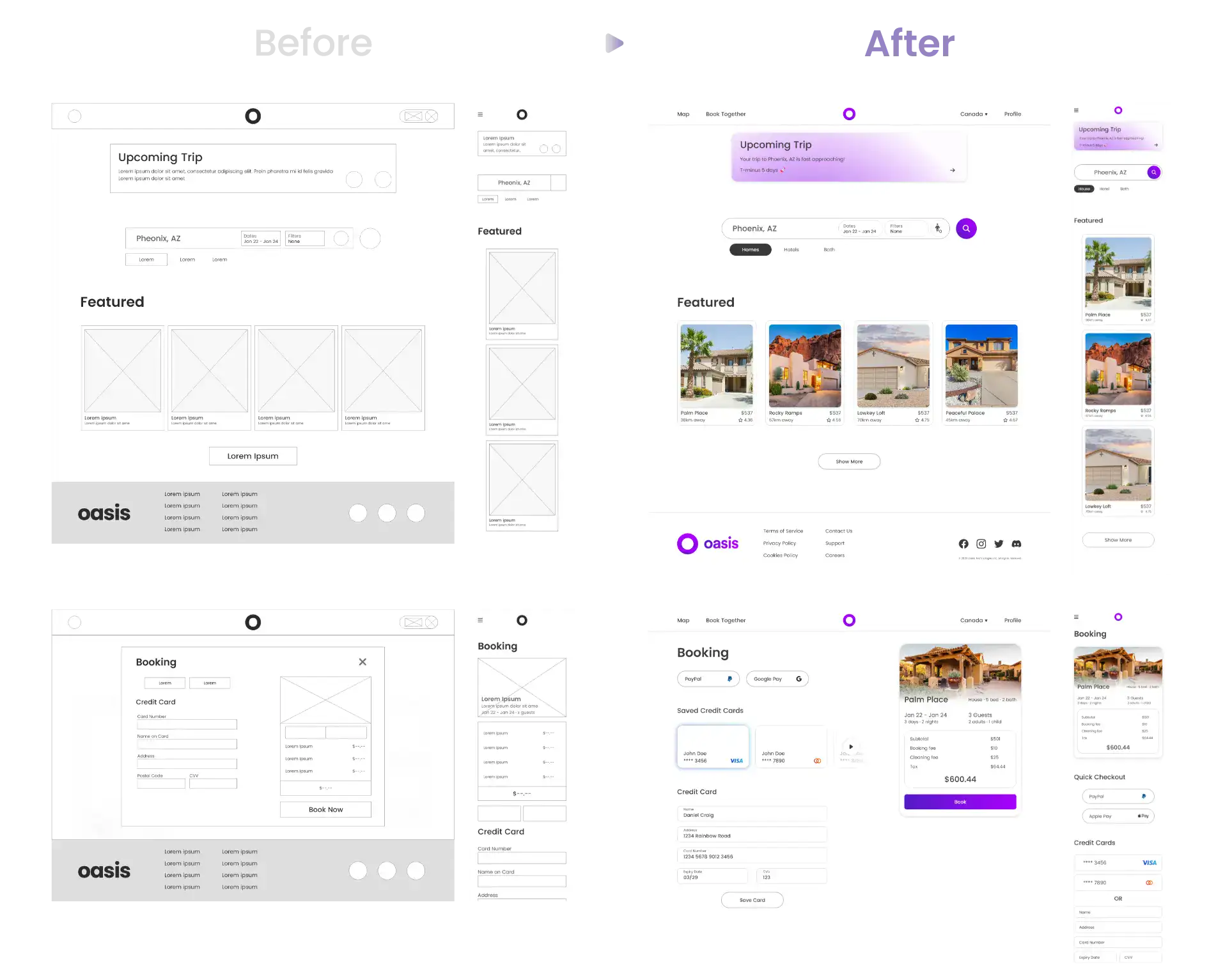
Additionally, the mockups were crafted with the following accessibility features in mind.
Clear and consistent text styles inform the visual hierarchy of each page.
As there is a heavy emphasis on images, each image contains alt text to help screen readers identify the content of the pictures.
Important elements have high contrast, making it stand out from the background.
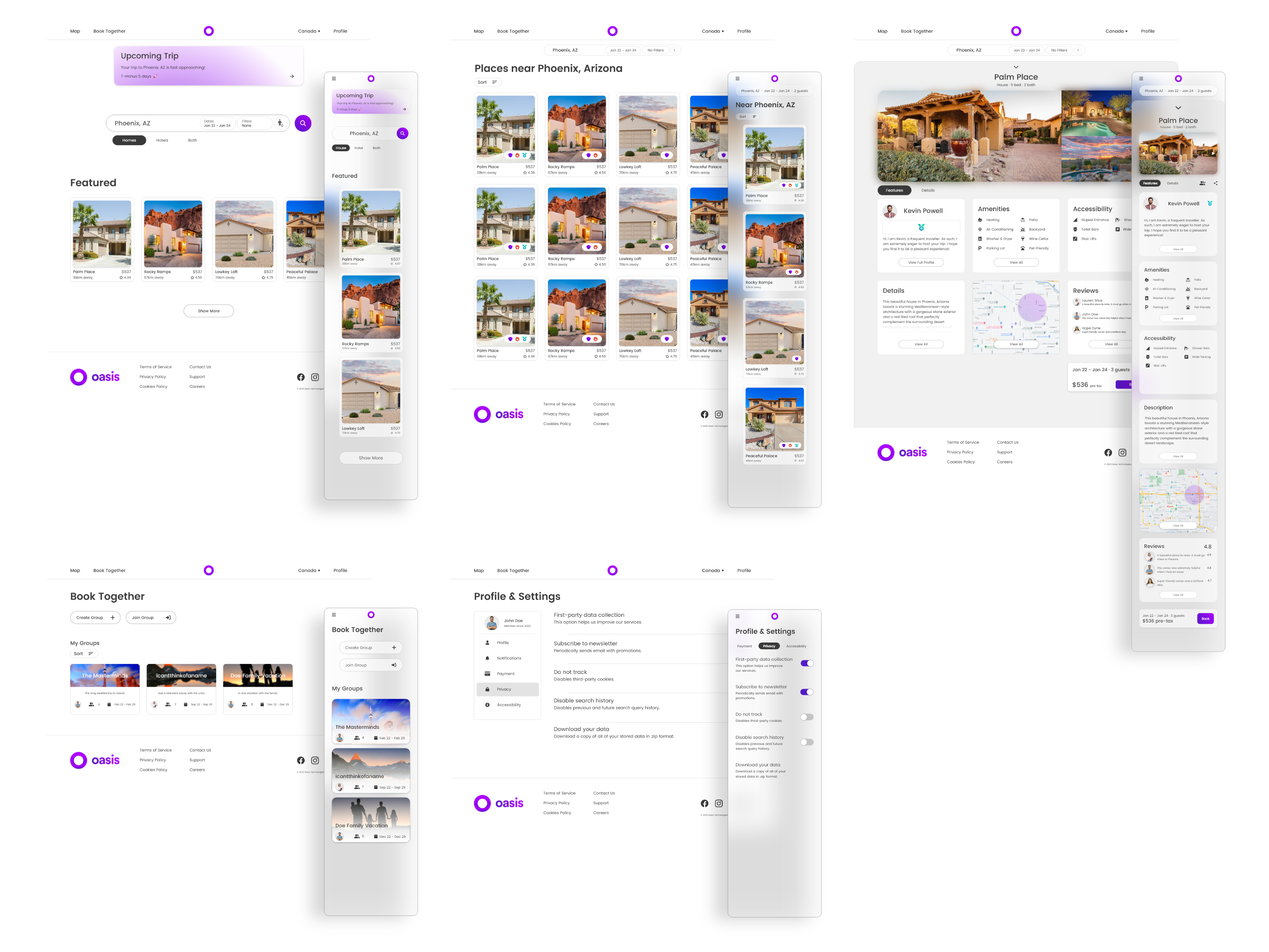
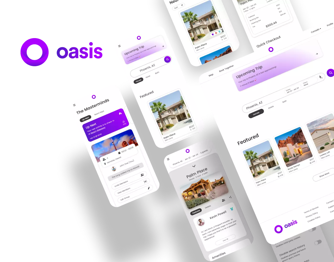
Final Design
Concluding Thoughts
The Oasis project has been an extremely rewarding experience. I had the
opportunity to learn the ropes of Adobe XD and apply the design process at
the same time. I also got to delve into the realm of responsive web
design, which is crucial in today's landscape.
Overall, I could not implement all of the features I wanted to due to the lack
of time. However, those ideas may be realized in future designs.
Thank you for taking the time out of your day to check my case study on Oasis.