
Summary
Users find that registering to vote is not always simple. SwiftVote is a service that empowers individuals to register to vote. The service aims to offer features that make it easy for users to register and stay on top of their registration.
Identify pain points with the voting registration process. Design an app and responsive website to alleviate the problems.
UX Designer
- Mockups
- Prototyping
- Responsive Design
- Usability Studies
- User Interview
- Wireframing
Research
The project began with a user interview aimed at determining the roadblocks to voting registration. The participants raised issues such as, difficulty scheduling and lack of electoral knowledge. During the interview, some users revealed that the registration process is complex. To better empathize with users during the design process, I created two personas that encapsulate user frustrations.

- Name: Mark
- Age: 42
- Role: Accountant
- Location: Calgary
Mark is a father to two children. He is extremely busy, if not with work than with his children. In the last few years, Mark skipped voting for the election due to scheduling conflicts. Furthermore, he is afraid of wait times.

- Name: Sam
- Age: 20
- Role: Student
- Location: Edmonton
Sam is a very punctual student, taking time to plan everything. As a student, Sam spends a lot of her time studying and is not up to date with upcoming elections nor the candidates.
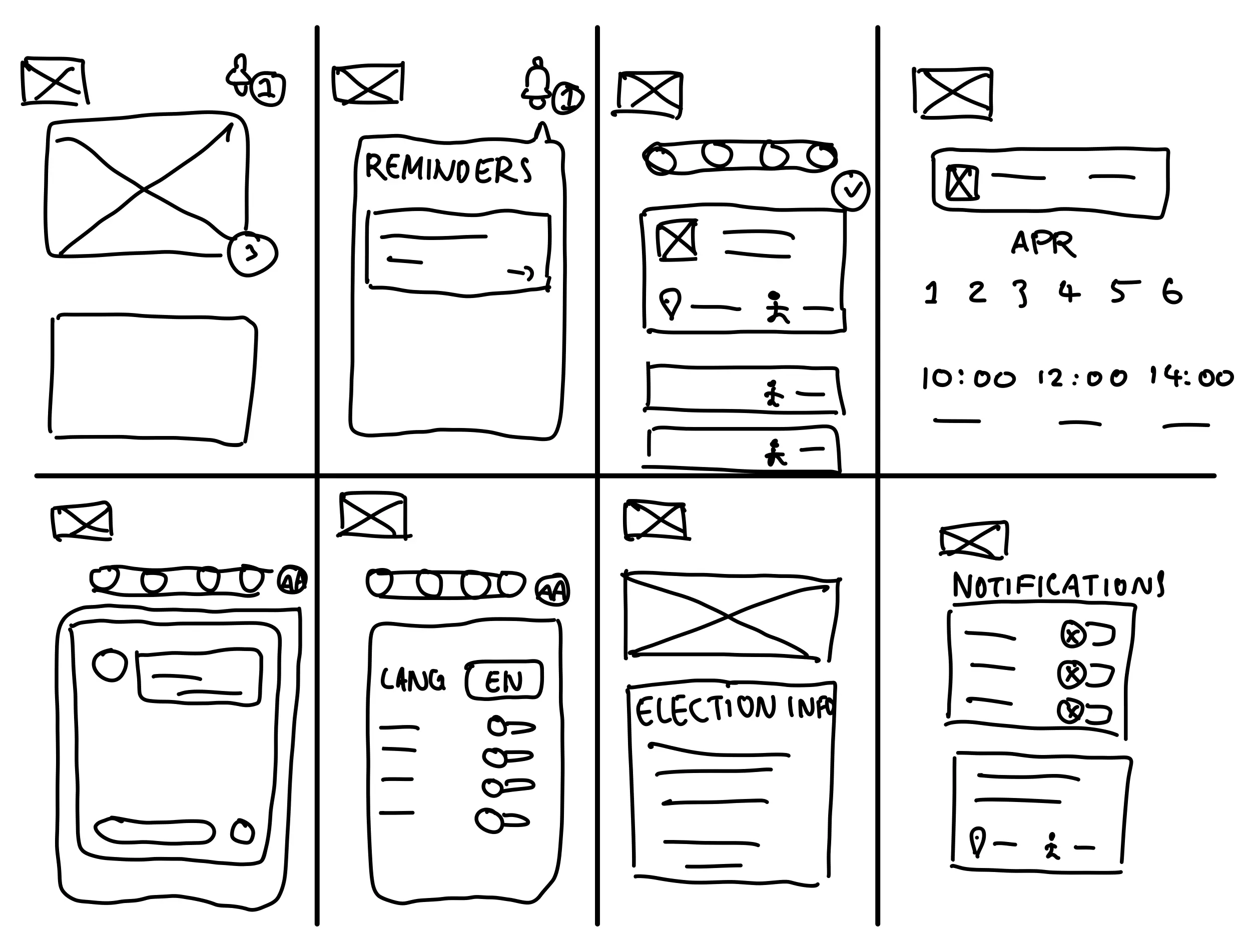
Afterwards, I started to brainstorm ideas to solve user problems. I began with the Crazy-8's exercise, dividing up a page into eighths. Within each section, I sketched potential ways of alleviating pain points. I focused on areas such as reminders/notifications, accessibility, and electoral information.
Starting the Design
After the ideation pase and sketching of paper wireframes, I created digital wireframes. These wireframes serve the purpose of resolving issues that users had with other implementations.
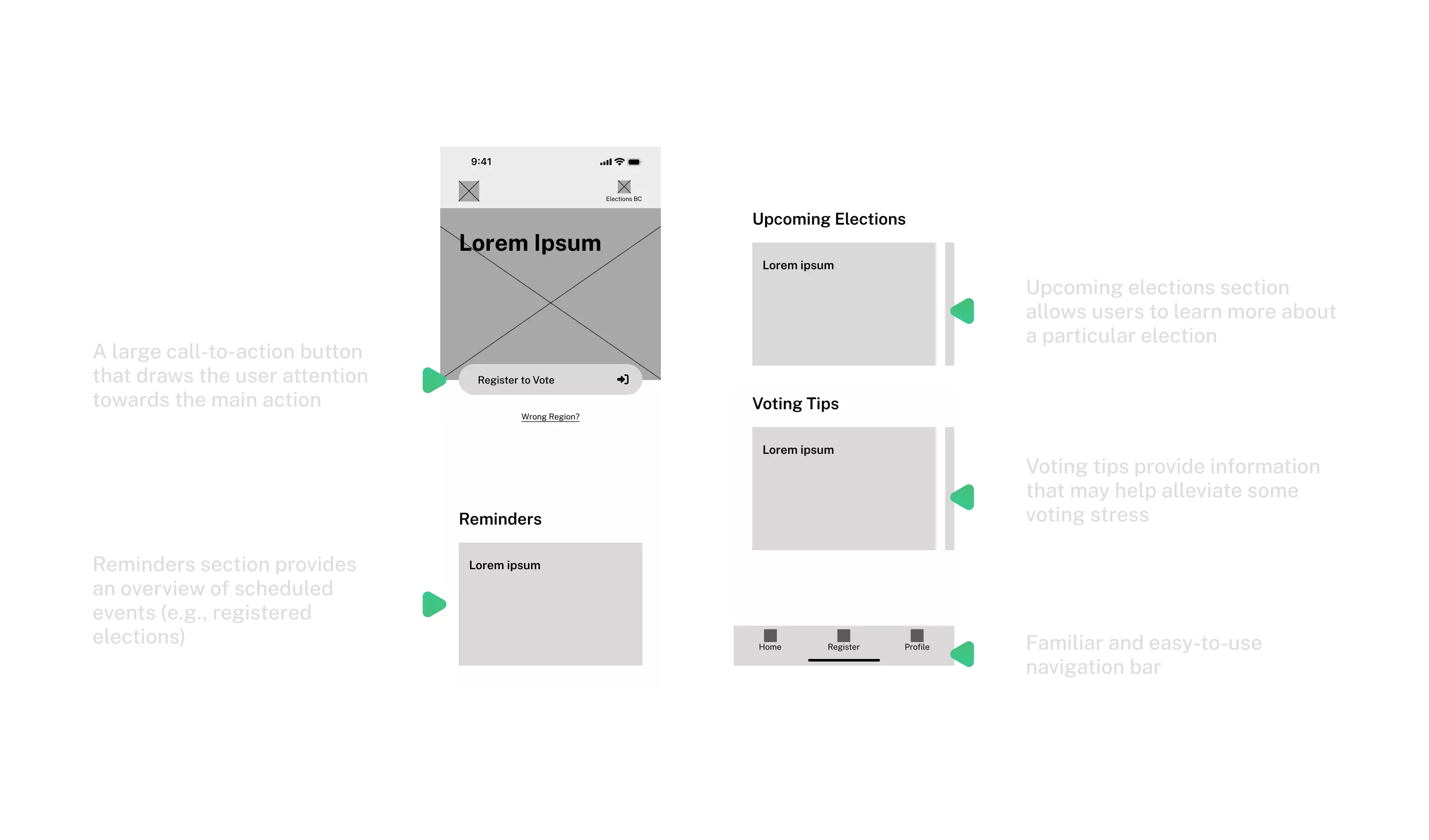
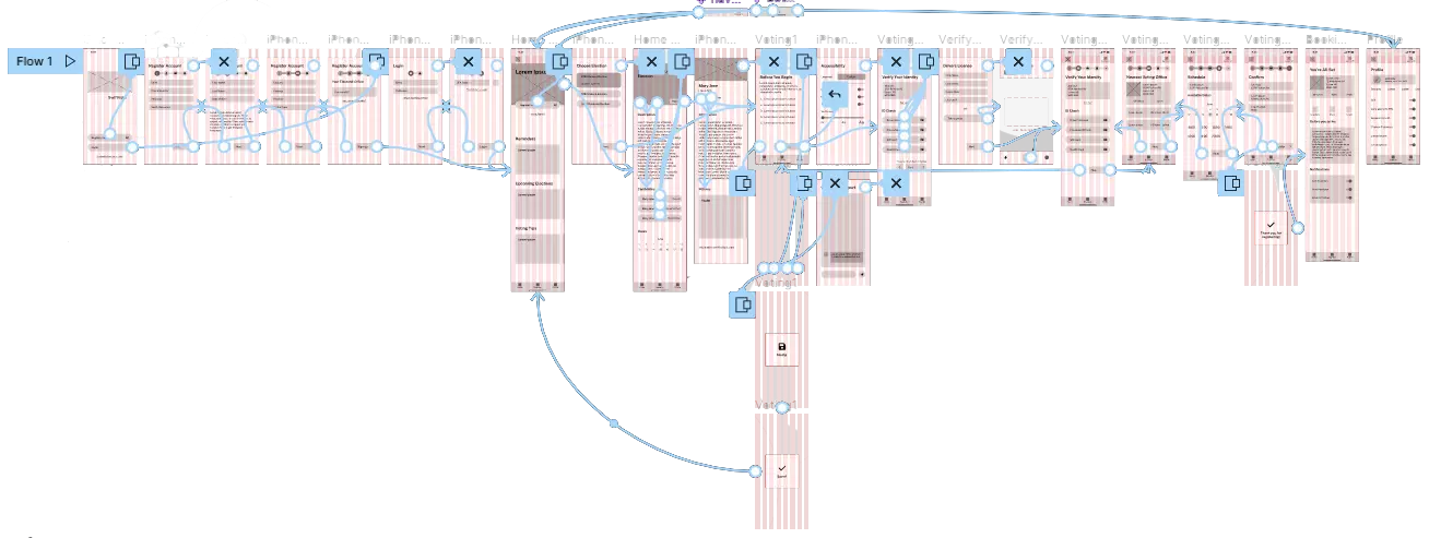
After creating the screens for the main user flow, I linked them up to create an interactive low fidelity prototype. The prototype enabled testing via usability studies.
User Testing
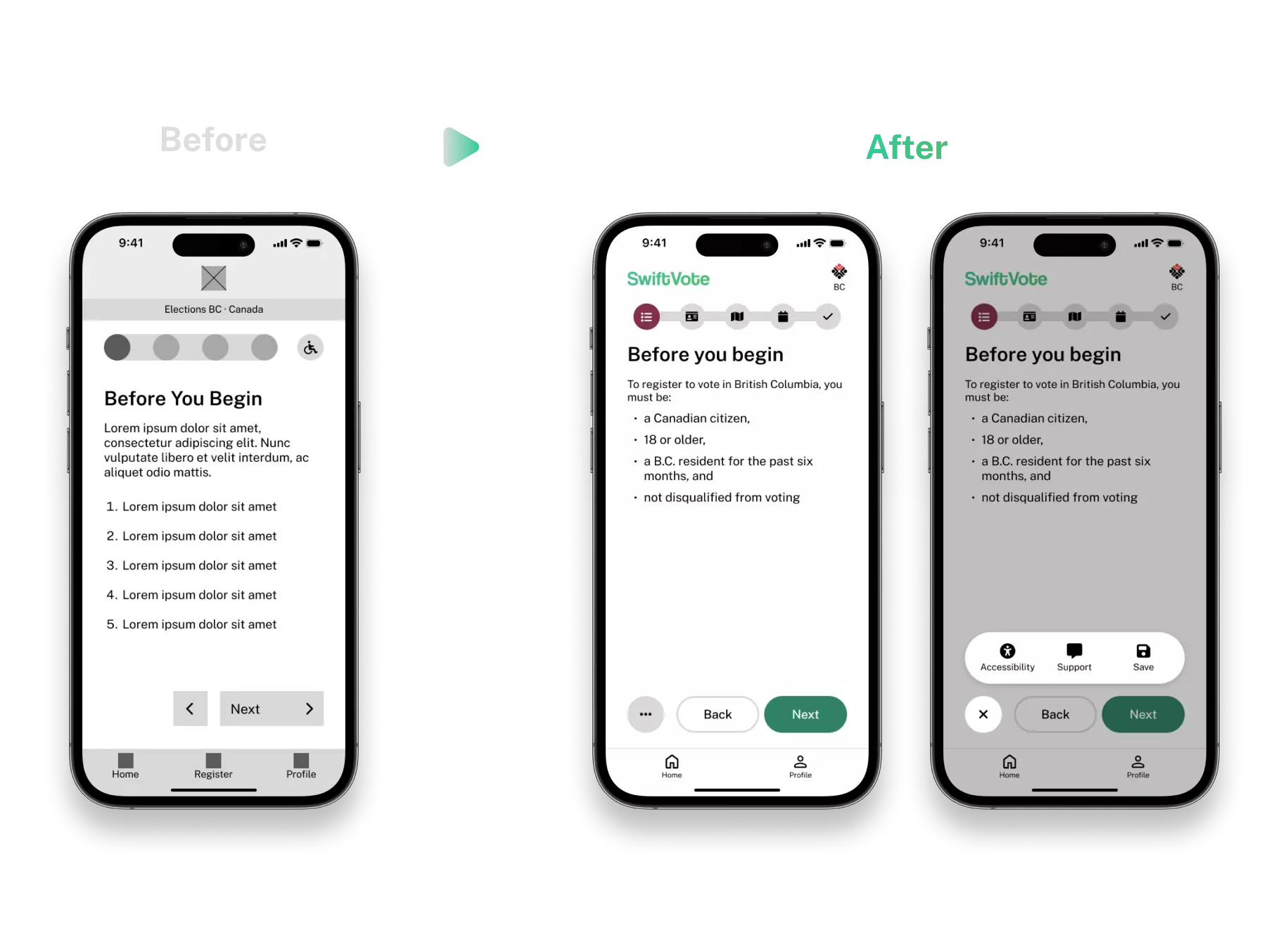
After connecting the wireframes into a low-fidelity prototype, I set out to test it with a usability study. The parameters of the study include: (1) An unmoderated usability study, (2) remote study in Canada, (3) six particiapnts, and (4) a duration of 40 minutes. The data from the usability study gave three important insights.
Users found the progress tracker during voter registration confusing. They also found the accessibility button a bit confusing as it is similar to the progress tracker.
The users wanted a way to contact support during registration in case they have questions or concerns.
Users needed a way to quickly research about candidates that are participating in a specific election to better inform their decisions.
Thus, with consideration of the insights, I implemented the changes into the mockups of the design. In addition, I utilized iconography, typography, and colour to make it a more polished iteration.
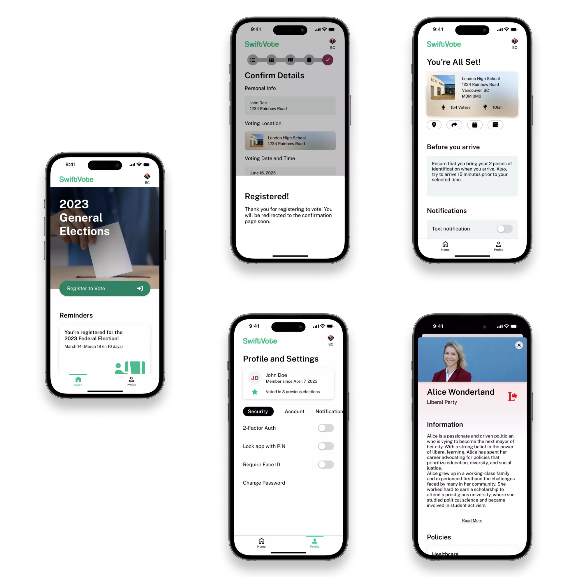
High-Fidelity Prototype
After creating each screen of the mockups, I created a high-fidelity prototype. This iteration contains a similar user flow when compared to the low-fidelity prototype. However, this prototype features changes that were prompted by the usability study.
While creating the high-fidelity prototypes, I ensured that I designed with accessibility in mind. For instance, some of the accessibility considerations include,
Clear and consistent use of font sizes for different elements (e.g., heading, paragraphs) inform the visual hierarchy of each screen.
Important elements have high contrast, making it stand out from the background (e.g., buttons, toggles).
The app features a navigation bar that enables users to quickly jump between the most important screens. It is both familiar and easy-to-use.
Responsive Design
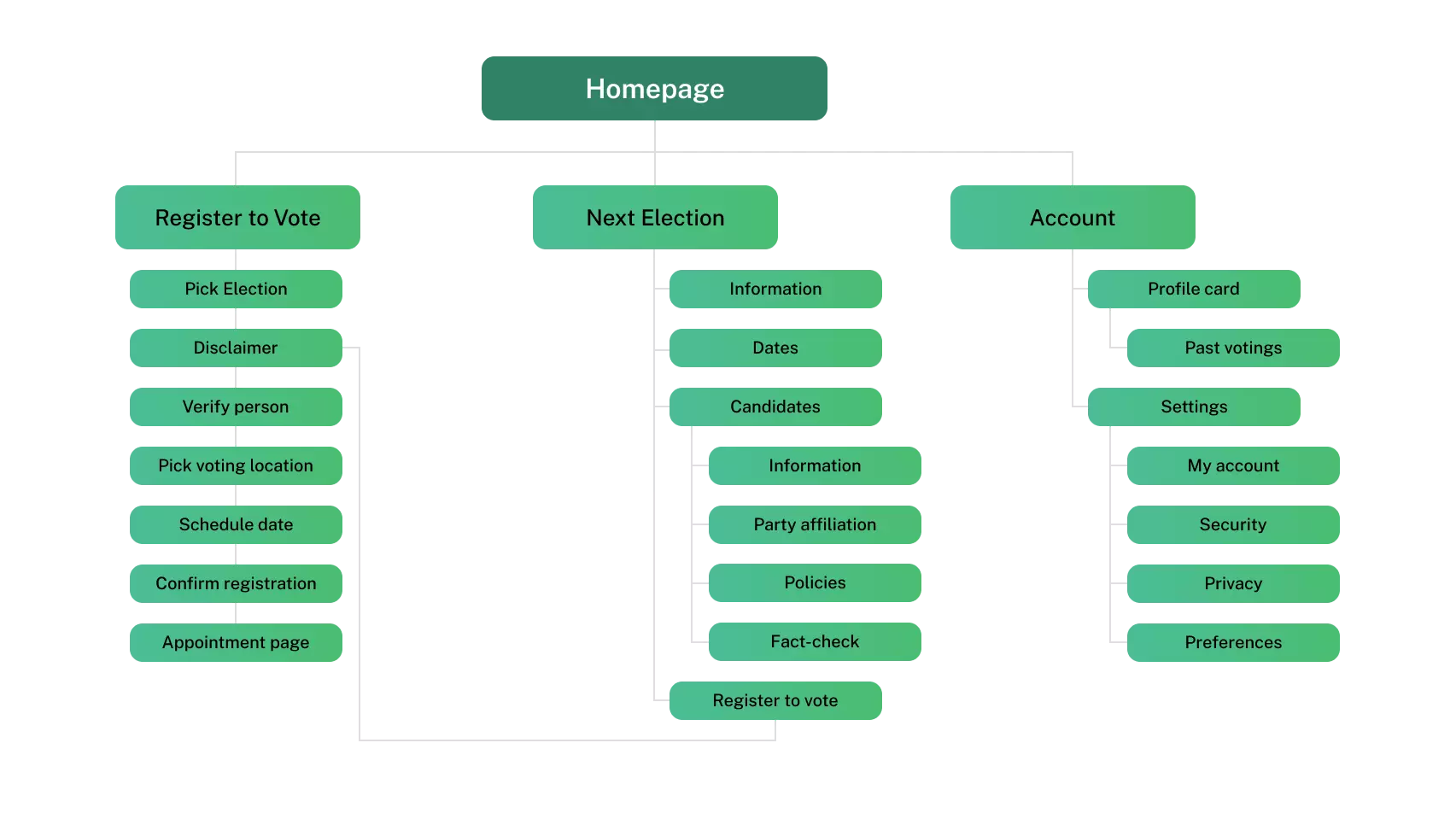
After designing the app, I began working on the complementary responsive website. The website enables users who use do not want to download an app or use a larger device to access the service. I first created a sitemap to visualize the organization of the pages to maintain consistency through the experiences.
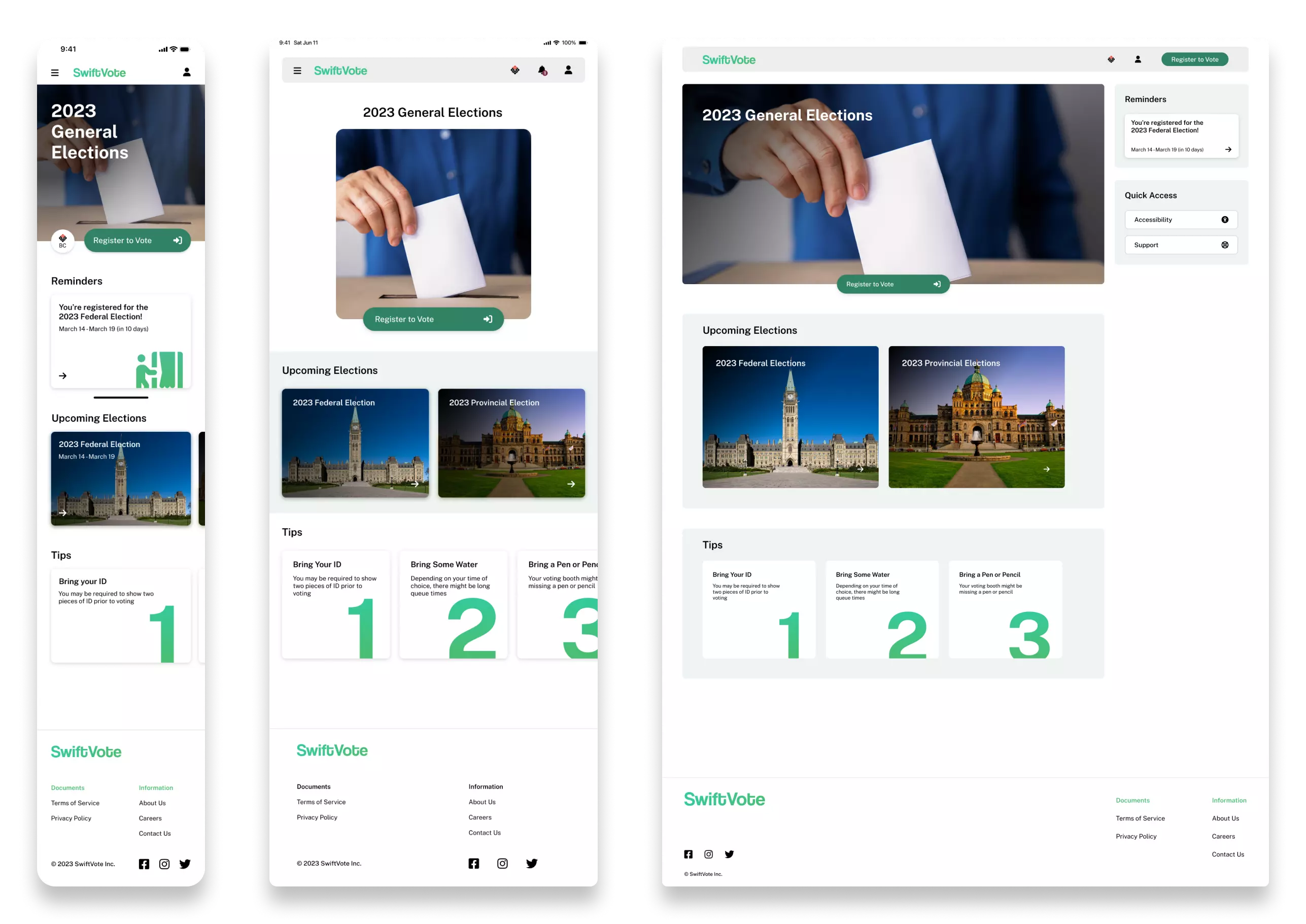
With the sitemap in mind, I designed variations of the website for mobile, tablet, and desktop screen sizes. I kept the same design language throughout the experiences to ensure consistency. Furthermore, as various screen sizes can fit fewer or more elements, I took advantage of the avaliable space. For instance, the desktop website has a persistent side bar that shows relevant information depending on the screen.
Concluding Thoughts
The SwiftVote project has been an invaluable learning experience. It is a
case study focused on designing for the greater good. In this case, I
tackled the problem of non-voters. I conducted research into why some
individuals decide not to vote. For instance, some stated difficulty when
scheduling for an election. Thus, I designed a method to check how many
people sign up for any given voting session. Through user-centred design,
I was able to solve problems that would otherwise prevent people from
voting.
Furthermore, this project served as a great opportunity regarding designing
for different mediums. I had to consider how a user would use the service on
various platforms and how to best utilize the space each device affords. I
believe that by going through the design process, I created a cohesive experience
that emphasizes consistency.
Given more time, I could further optimize the space utilization for the differing
screen sizes.
Thank you for taking the time out of your day to check my case study on SwiftVote.