
Summary
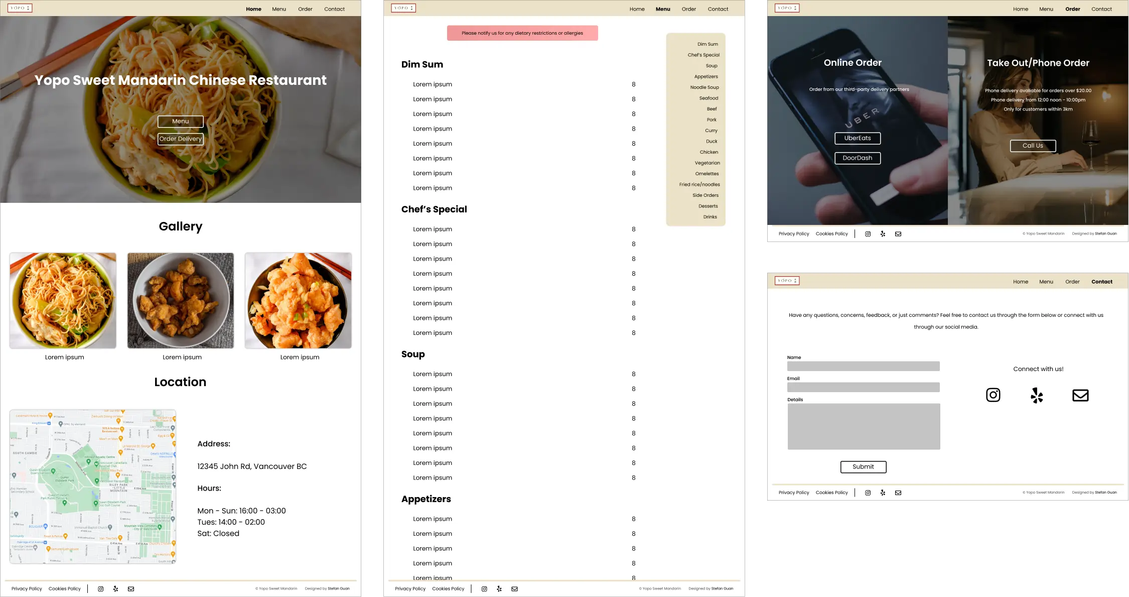
Yopo Sweet Mandarin is a restaurant serving up traditional Chinese food. They are located in the heart of Yaletown, Vancouver BC.
To revamp Yopo Sweet Mandarin's online presence. Around this time, COVID-19 hit local businesses and restaurants especially hard. With many places limiting walk-in service, I noted that having a strong online presence is a key to success. The previous website had accessibility and usability challenges.
Web Designer/Developer
- Developer
- Mockups
- Prototyping
- Responsive Design
- Stakeholder Management
- Usability Studies
- User Interview
- Wireframing
Research
I kicked off the project by conducting user surveys. I got in contact with some of the patrons through the owners. Some of the inqueries included: frequency of visiting the website, intent, roadblocks, and more. The survey resulted in important challenges that the new design has to solve.
The users browsed the website through their mobile phones. They found that the site was not mobile friendly. For example, they had to frequently zoom in and out.
The users found it difficult to find dishes via categories. For instance, they had to manually scroll to find the main category of the dish.
When asked about the online ordering services, the patrons were not aware that they can order through the delivery partners.
Concept
With the user challenges in mind, I then investigated restaurant website designs. For example, I looked at restaurants like Miku and Blue Water Cafe. I noticed some patterns:
The websites all had large buttons flanking the hero section. They provide quick and easy access to the important pages (e.g., menu).
The websites had the menu items organized neatly. The menu provided graphics to indicate different attributes (e.g., spicy, vegetarian).
The websites always made it easy to find contact information. Social media links and phone numbers were easy to find (e.g., in the footer, in a contact page).
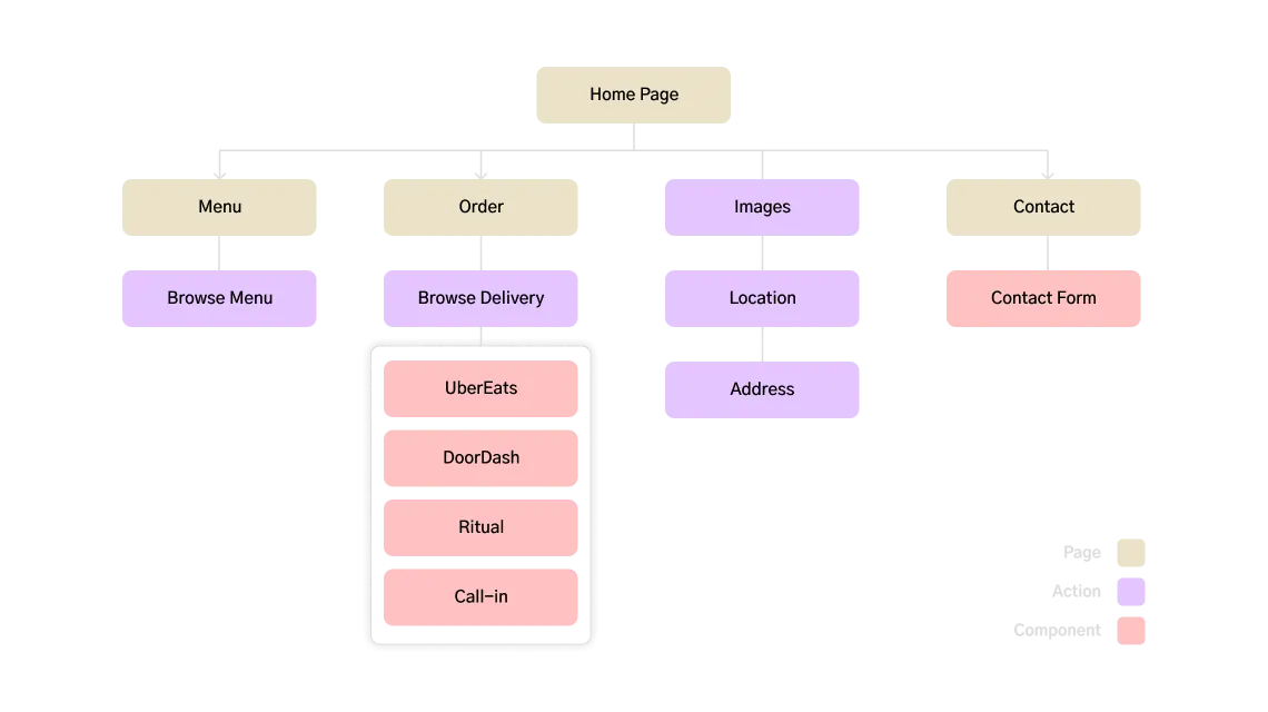
Given the feedback from patrons and knowledge from other restaurants' sites, I drafted up a quick diagram for the sitemap. Which consequently helped me with the initial wireframes. As the mobile space grows, I decided to take a progressive enhancement approach. That is, designing for mobile users first, then scaling upwards for desktop.
User Testing
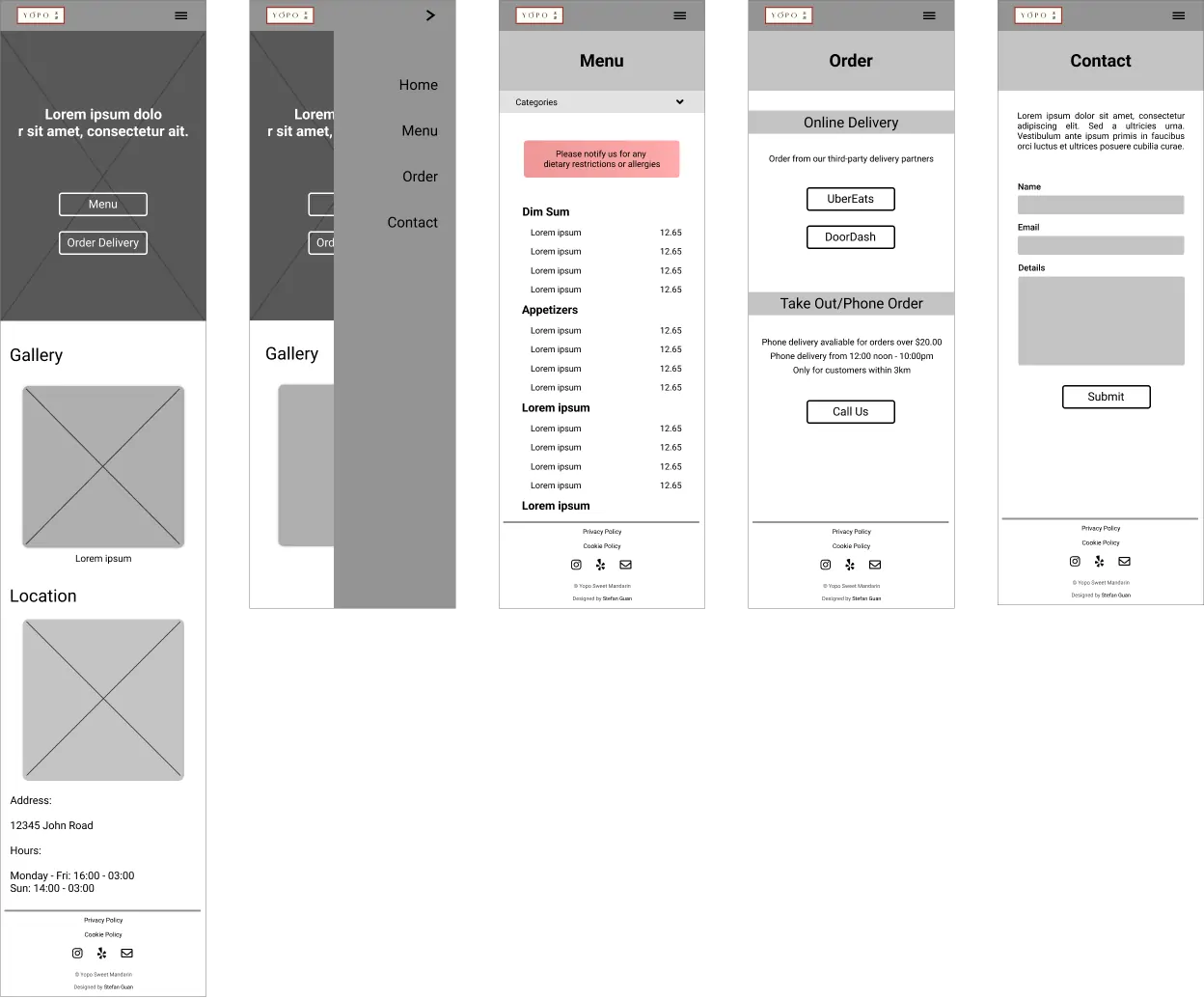
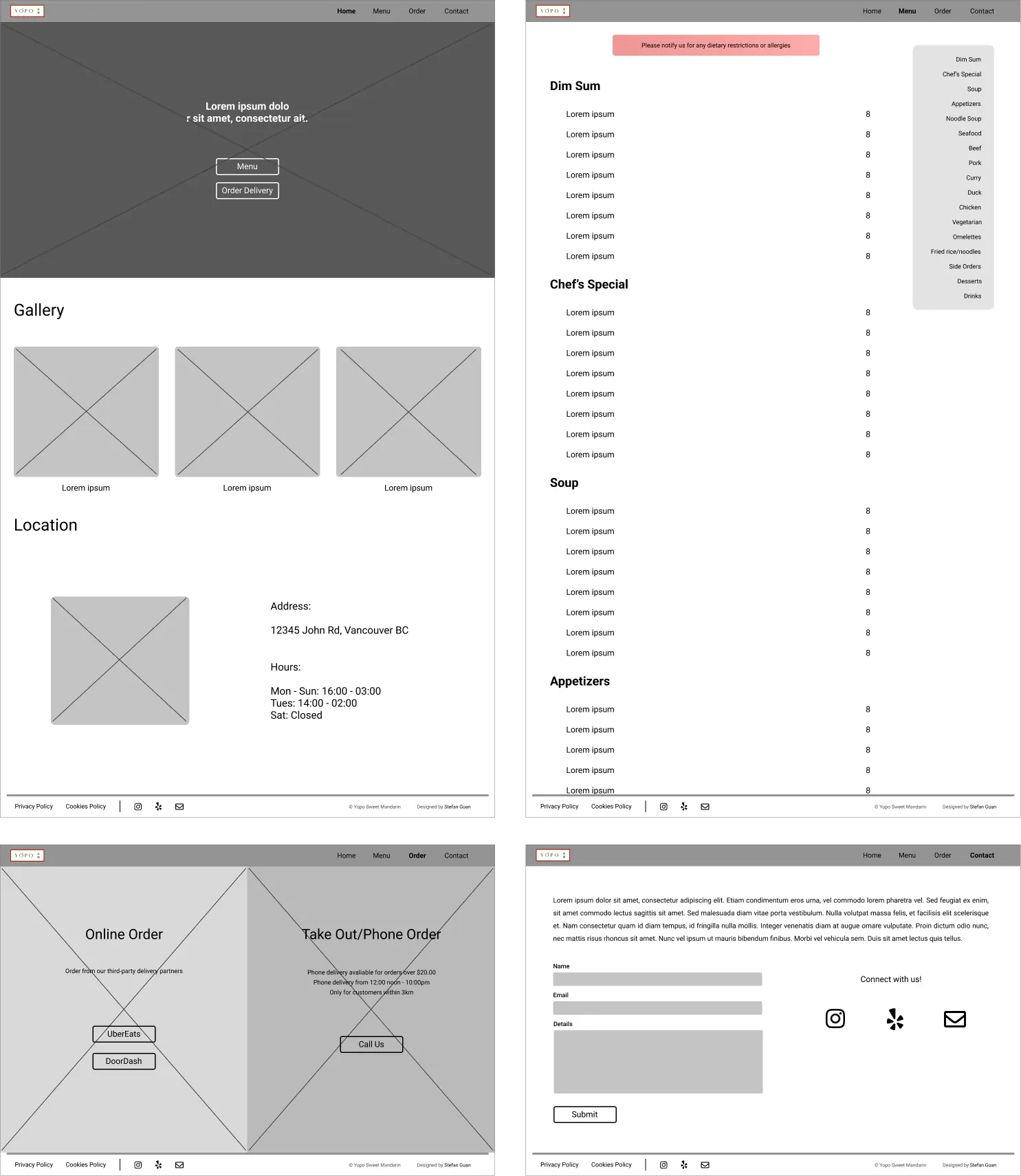
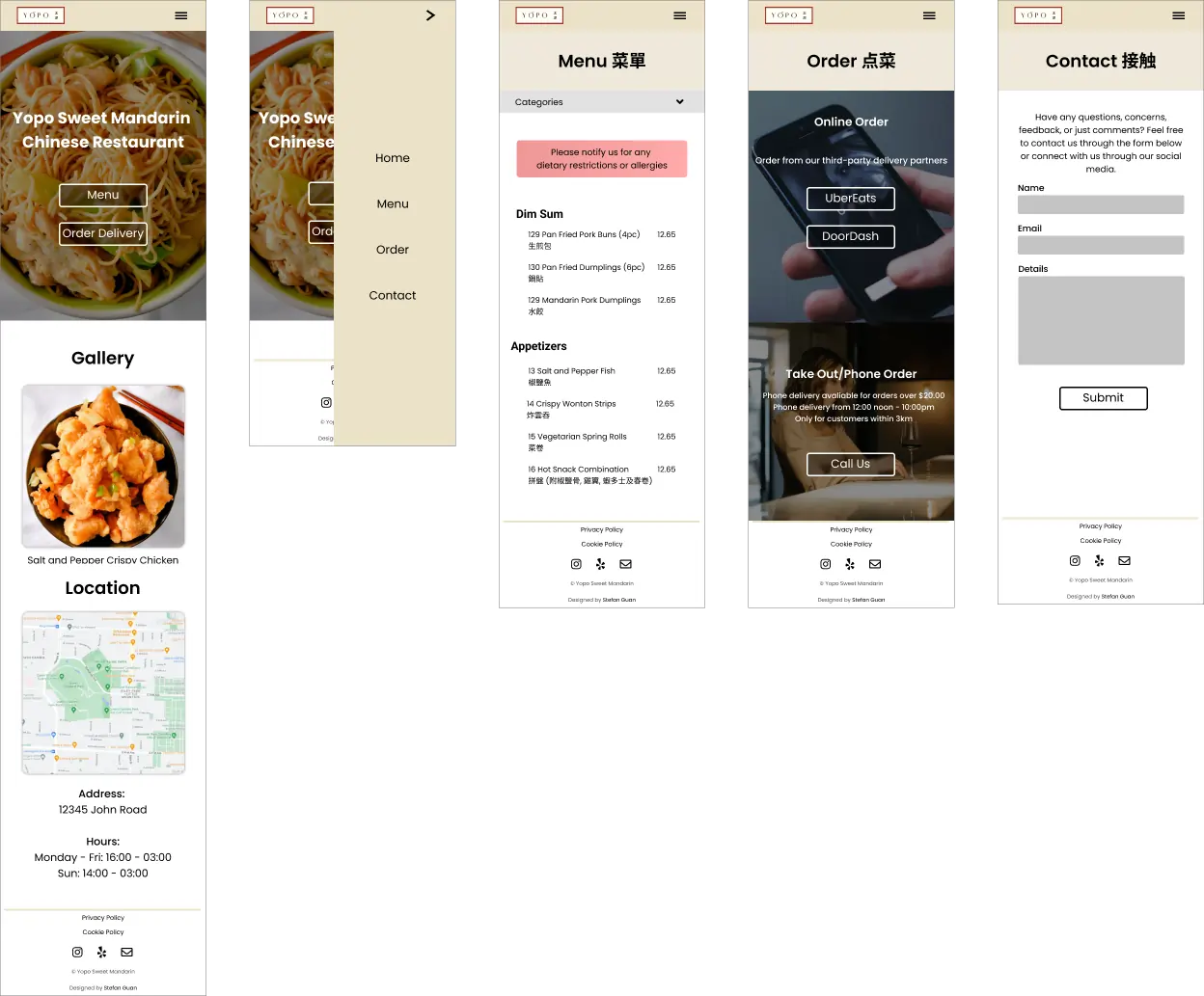
I gave the prototype to the owner and some of their patrons to test out the new design. They generally liked the visual refresh but found some minor issues. For example, the mobile navigation menu elements were placed too high and the map was too small on the desktop view. Provided with the feedback, I created mockups for both mobile and desktop.
Concluding Thoughts
I initally offered to overhaul the website as I noticed the user
experience was sub-optimal. I leveraged my Google UX Design Course
knowledge to conduct user research and see how I could improve the
website. Through iterative design and data-driven decisions, I was able to
develop and deploy a static website befitting of the restaurant.